Why This Matters
Today, money feels almost invisible. Instead of using cash, kids are growing up watching their parents tap a phone, swipe a card, or even pay with a watch. Because of that, the connection between spending and actual value is not always clear.
As digital payments become the norm, the way kids learn about money has to evolve too. Parents want to teach good financial habits early, but a lot of the tools out there feel too complex, too controlled, or do not actually help kids understand what is happening when they spend. Parents are also looking for something they can trust, something that feels safe but also actually teaches, not just tracks.
Without that clear connection, it is easy for kids to grow up not fully understanding the value of money.
That is what got me thinking. How can we make money feel easier to understand for kids in the moments they are actually using it, while still making sure parents feel comfortable and trust it?
That is where the idea for Primis came from.
Competitor Insights
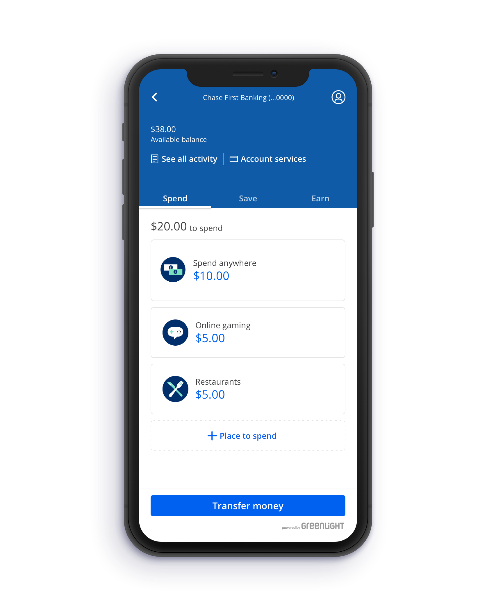
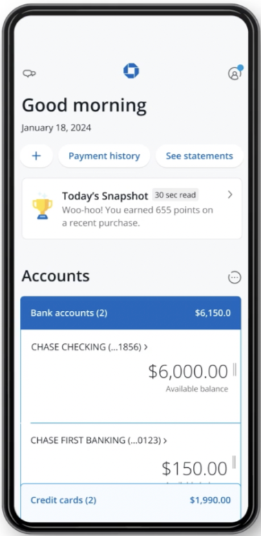
From looking at existing tools, I noticed that many apps focus on access and safety, but not as much on learning. For example, Chase First Banking creates a strong sense of trust and parental oversight, but the experience feels more adult. Important information like balance is not clearly emphasized, and spending does not feel connected to its impact. Kids have to take extra steps just to see what happened, which creates a gap between action and understanding.
On the other hand, Greenlight does a better job with visual clarity. It separates money into categories like spending and savings, uses clear layouts, and includes progress bars and interactive lessons. These features help make financial concepts feel more engaging and easier to follow. However, a lot of the learning still happens in separate sections instead of during real spending moments, and the interface can feel a bit dense.
Overall, I found that while these tools support financial management, they do not fully connect everyday actions with meaningful learning experiences.
Child’s Screen
Chase First Banking
Parent’s Screen
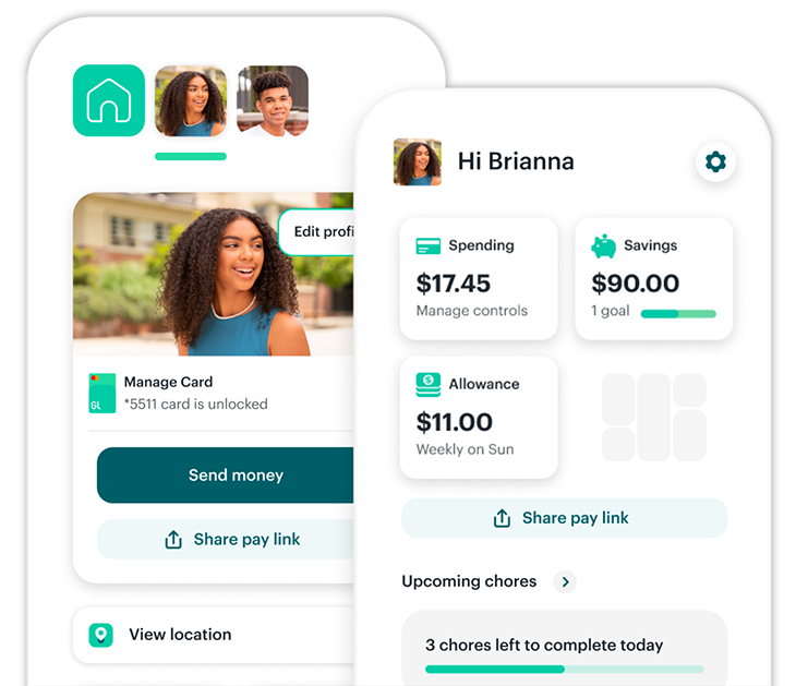
Child’s Screen
Parent’s Screen
Greenlight
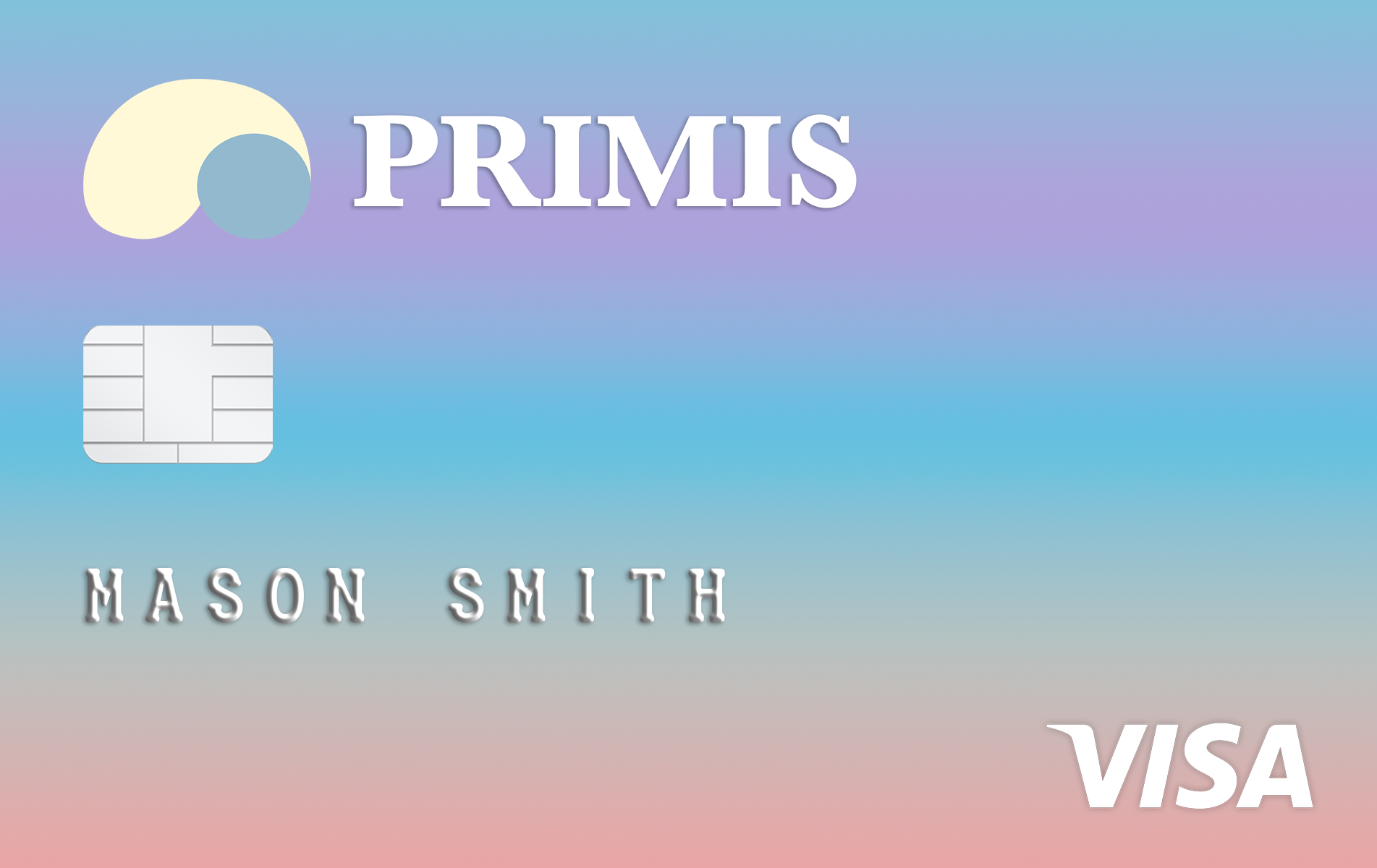
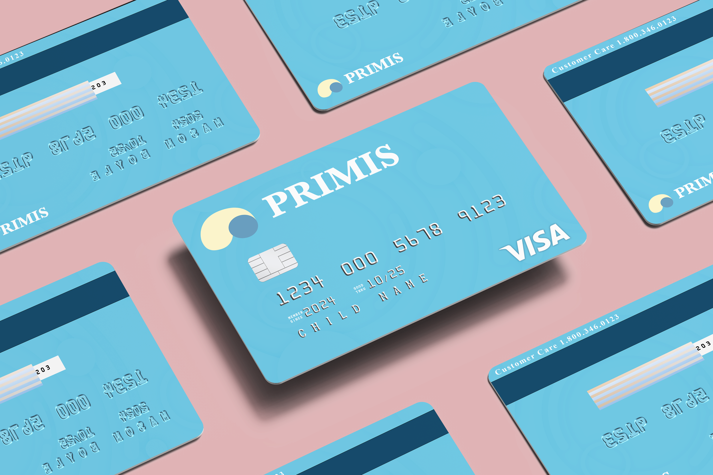
Primis - Branding Overview
For the branding, I really wanted to make money feel less intimidating and more approachable for kids, while still feeling trustworthy for parents. A lot of financial tools feel very serious or overwhelming, so I wanted this to feel simple, clear, and easy to understand from the start.
Visually, I leaned into brighter colors, soft shapes, and clean typography to make everything feel more welcoming and not too heavy. I wanted it to feel a little playful so kids stay engaged, but still grounded enough that parents feel comfortable and trust it.
Overall, the brand is really about balance. It is about making learning about money feel natural for kids, while also creating something parents feel good about using with them.
Research Insights
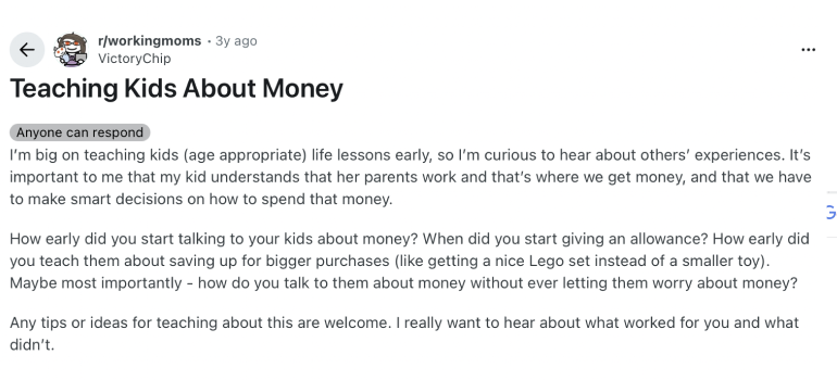
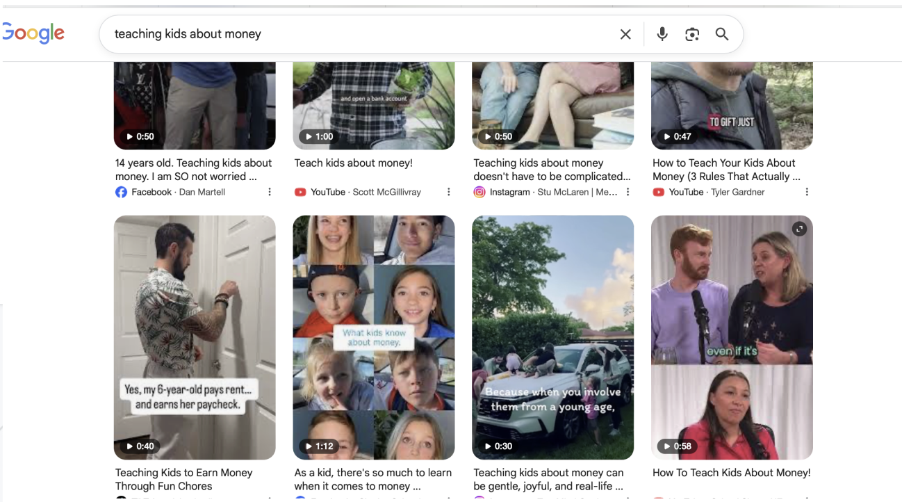
While exploring how families teach kids about money, I looked at real conversations across communities like Reddit. A pattern that kept coming up was that parents want their kids to feel confident with money, but many are not sure how to teach those skills, especially now that most spending is digital.
One thing that stood out is how much harder digital money is for kids to understand. Without being able to see or physically interact with it, money becomes more abstract. Kids tend to understand it better when it feels visible, connected to their actions, and tied to something they care about.
I also noticed that a lot of parents feel some level of guilt or uncertainty. They want to build good habits early, but feel overwhelmed or unsure if they are doing it the right way. At the same time, kids are open and willing to learn, they just need more clarity and a way to see their progress.
Overall, families are not just looking for a tool that tracks money. They want something simple and supportive that actually helps kids learn, while still giving parents visibility without feeling like they have to constantly manage everything.
These insights highlighted an opportunity to design an experience where financial learning feels clear, intuitive, and connected to real everyday moments.
Opportunity
There is an opportunity to make money feel more clear and connected for kids in the moments they are actually using it, not separate from it.
Instead of just tracking money, the experience can turn everyday actions into learning, helping kids understand value while still building trust for parents.
That is where Primis comes in. Primis is designed to make money feel visible, simple, and easy to understand through real time feedback, clear visuals, and small learning moments built into everyday interactions.
It creates a balance where kids can learn by doing, while parents still feel confident, supported, and in control.
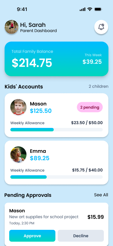
Key Features
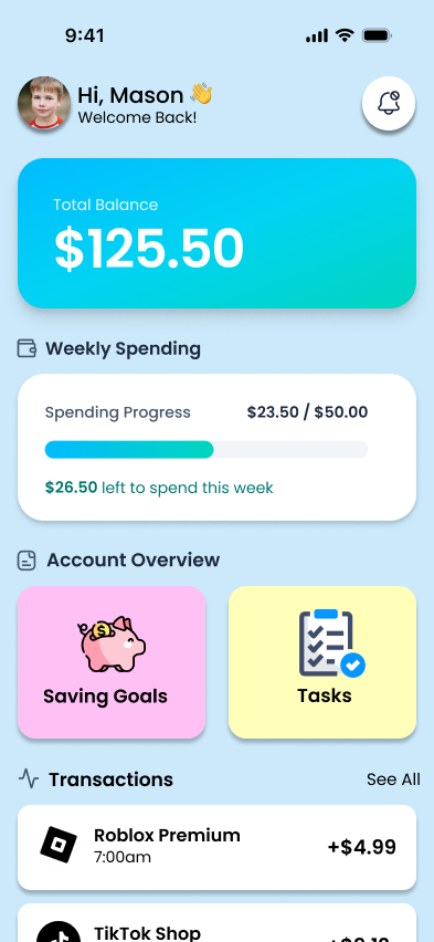
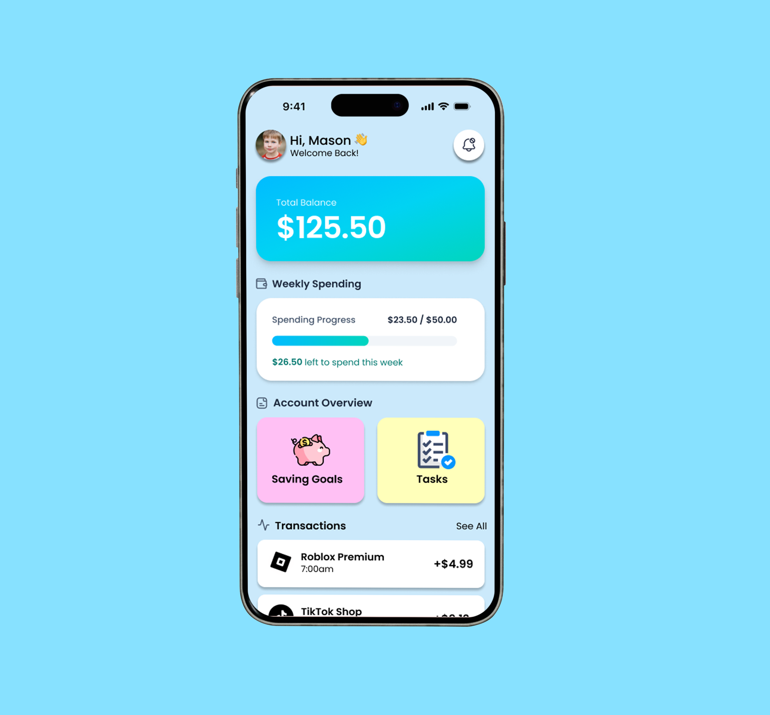
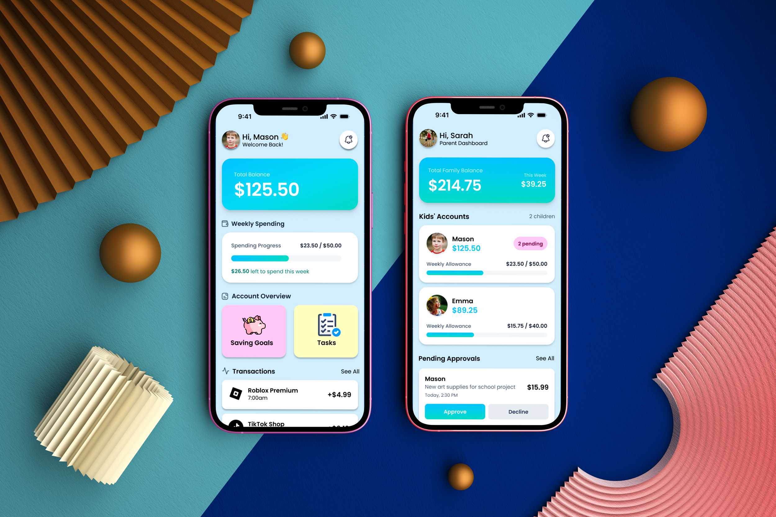
Clear Money Awareness
Large balance cards make money easy to understand at a glance. Simple language like “Total Balance” and “Weekly Spend” introduces basic financial concepts in a way that feels natural.
Budgeting Made Simple
Weekly spending bars show how much has been used and what is left, helping kids build an early understanding of budgeting.
Encouraging Saving Habits
A “Saving Goals” section helps kids set goals and track their progress, making saving feel more real and motivating.
Learning to Earn
A “Tasks” section connects money to responsibility, showing kids how they can earn through completing small tasks.
Real Transaction Experience
A simple transaction list introduces the difference between income and spending, making money movement more visible.
Parental Guidance and Safety
Parents have a dashboard to monitor balances, manage allowances, and review requests. Approval features also encourage kids to ask before making purchases.
Confidence Through Friendly Design
Warm visuals, large tap targets, and friendly interactions keep kids engaged and make learning about money feel approachable, not intimidating.


Success Metrics
As a theoretical project, these metrics highlight how I would measure impact if this were a live product. This is also where I’m glad I have experience working in programmatic, because I’m able to think not just about design, but also about how performance, engagement, and optimization tie together.
What I Would Measure:
Onboarding completion
I want to see if families can easily create an account and set their first savings goal without running into friction.
Feature engagement
I’d look at what kids naturally interact with most, whether it’s Savings, Request Money, or Learning.
Learning/Tasks progress
I’d track how often kids complete lessons and whether they return to them, since that shows real understanding is forming.
Parent involvement
I’d monitor how often parents review activity or approve requests to see if the app is actually supporting them, not overwhelming them.
Savings goal momentum
I’d watch how often goals are created and completed to understand whether healthy habits are sticking.
Impact of gamification
I’d measure whether badges and milestones actually motivate kids or just sit in the background.
Family retention
I’d look at whether families keep coming back over time to understand the long-term value of the experience.